


Custom Label Design Tips: Creating Professional Product Labels
Creating professional product labels is more than just adding your logo to a sticker. Effective label design combines art and science to attract customers, communicate essential information, and strengthen your brand identity. Whether you're launching a new product or refreshing your existing packaging, thoughtful label design can significantly impact your product's success in the marketplace. The right label not only captures attention on crowded retail shelves but also conveys crucial product details, builds consumer trust, and reinforces brand recognition at every touchpoint. This comprehensive guide will walk you through the essential considerations for creating custom labels that not only look great but also perform well in real-world conditions.
Understanding Label Materials and Their Applications
The foundation of any successful label design begins with selecting the appropriate material. Different products require specific label materials to ensure durability, legibility, and aesthetic appeal throughout their lifecycle. The material choice affects not only how your label looks but also how it performs under various environmental conditions, handling scenarios, and storage situations. Making the right material selection early in the design process can prevent costly issues down the line.

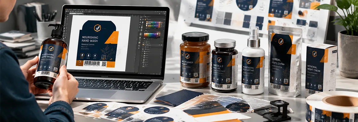
For products exposed to moisture, such as shampoos and cosmetics, waterproof materials are essential. Our shampoo labels are specifically designed to withstand bathroom environments with high humidity and frequent handling. These specialised labels feature options in glossy, matte, or transparent finishes, all resistant to water and friction to maintain their appearance throughout the product's life. The materials are engineered with water-resistant adhesives that prevent edge lifting or bubbling even after repeated exposure to moisture, ensuring your branding remains intact and professional-looking until the last drop of product is used.
For premium cosmetic products, textured paper labels provide a sophisticated tactile experience that elevates brand perception. The embossed surface adds a refined feel that communicates quality and style, making them perfect for exclusive skincare products and premium cosmetics. These specialty papers feature subtle textures that engage multiple senses, creating a memorable unboxing experience that enhances perceived value. The textured finish also helps disguise minor imperfections and fingerprints, maintaining a pristine appearance even after repeated handling by consumers in retail environments.
For food products, material selection becomes even more critical as it must meet regulatory requirements whilst maintaining visual appeal. As a HACCP audited supplier of food labels, we ensure all materials meet strict safety standards. Our food labels use low-migration colours, varnishes, foils, and papers that prevent chemical transfer to food products. This certification guarantees that our labels comply with food safety regulations across multiple jurisdictions, providing peace of mind for manufacturers and consumers alike. Additionally, our food-grade materials are tested for compatibility with various product types, ensuring they maintain their integrity even when exposed to oils, moisture, or refrigeration.
Our specialised honey labels combine aesthetic appeal with practical functionality, featuring materials that resist moisture and sticky residue. These labels maintain their appearance even when handled frequently during use. The specialised adhesives are formulated to adhere securely to glass and plastic containers even when exposed to the viscous nature of honey products. The print surface is treated to resist sugars and prevent smudging, ensuring that nutritional information and branding remain clear and legible throughout the product's shelf life, even if small amounts of honey come into contact with the label during dispensing.
For products requiring variable data printing or on-demand labelling, blank labels offer flexibility and convenience. Blank roll labels provide high flexibility for businesses that need to print variable information such as batch numbers, expiration dates, or pricing. These customisable stickers are ideal for use as address labels, shipping labels, or price tags. Available in various materials including paper, film, and specialty substrates, these labels can be run through thermal, thermal transfer, or direct thermal printers, allowing businesses to implement just-in-time labelling processes that reduce inventory costs and minimise waste from outdated pre-printed labels.
For businesses using inkjet printers, our blank labels for water-based inkjet printing feature a special water-absorbing print varnish that ensures sharp contours and smudge-proof results, even with small fonts. These labels are perfect for office and home labelling needs. The specialised coating rapidly absorbs and fixes water-based inks, preventing bleeding and ensuring crisp text and barcode readability. These labels are compatible with most consumer and business inkjet printers, making them an accessible solution for small businesses, craft producers, and home users who need professional-looking labels without investing in specialised printing equipment.

Creative Label Shapes and Structures for Brand Differentiation
Moving beyond standard rectangular labels can significantly enhance product visibility and brand recognition. Custom shapes and innovative label structures create immediate visual interest and help products stand out on crowded shelves. The human eye is naturally drawn to unique shapes, making unconventional label designs an effective way to capture attention in competitive retail environments where consumers make purchase decisions in seconds.
Special-shaped labels can be freely created in design and format to match your brand identity or highlight specific product features. These eye-catching labels immediately differentiate your products from competitors and create a memorable visual identity. Available with various adhesive options, including freezer-grade and removable types, these labels can be adapted for virtually any application. Custom die-cutting technology allows for precise creation of virtually any shape, from simple geometric forms to complex outlines that mirror your product or incorporate elements of your logo, creating a cohesive and distinctive brand presentation that consumers can recognise instantly.

For products that require extensive information but have limited space, multi-layer labels provide an innovative solution. Multi-layer labels printed on 2 sides effectively double your available space without increasing the label's footprint on the product. These labels are particularly useful for bilingual information, detailed instructions, or promotional content. The construction features a base label with a hinged top layer that can be lifted to reveal additional information underneath, then resealed for future reference. This innovative approach solves the challenge of fitting regulatory information, usage instructions, and marketing content on small containers without compromising design aesthetics or requiring microscopic text that frustrates consumers.
For even more content, booklet labels provide multiple pages of information whilst maintaining a clean product appearance. These labels are ideal for pharmaceuticals, complex electronics, or products with extensive legal information requirements. Our booklet labels offer flexibility in design and can be customised with various opening mechanisms for easy consumer access. Available in configurations ranging from simple two-page designs to complex multi-page booklets, these innovative labels can contain up to 60 pages of content whilst occupying minimal space on the product. The pages can be printed in full colour with various paper weights and finishes, allowing for creative presentation of detailed information, multiple languages, or supplementary content like recipes or usage tips.
Colour Psychology and Visual Hierarchy in Label Design
The strategic use of colour and thoughtful arrangement of visual elements significantly impacts consumer perception and purchasing decisions. Understanding colour psychology and implementing proper visual hierarchy ensures your labels communicate effectively at a glance. Research indicates that consumers form initial judgements about products within 90 seconds, and up to 90% of that assessment is based on colour alone, making your colour choices one of the most critical aspects of label design.
Colour Selection Strategies
Colours evoke specific emotions and associations that should align with your product's positioning and target audience. For food products, natural greens and earthy tones suggest organic or healthy options, whilst bold reds and yellows create a sense of excitement and urgency. Blue tones often convey trustworthiness and purity, making them appropriate for water products and cleaning supplies. Purple traditionally signals luxury or premium quality, whilst black suggests sophistication and exclusivity, making these colours suitable for high-end products. Understanding these psychological associations allows designers to strategically select colours that reinforce the product's intended positioning and appeal to the target demographic's preferences and expectations.
When designing food labels, consider how colour choices affect appetite and product perception. Cool blues and greens work well for dairy and refrigerated products, suggesting freshness and cleanliness. For preserves and jams, warm reds and purples emphasise the fruit content and richness of flavour. Research has shown that colour can even influence taste perception—red and orange tones can make foods seem sweeter, whilst green packaging may lead consumers to perceive products as healthier. Additionally, colour contrast plays a crucial role in readability, especially for nutritional information and ingredients lists that must remain legible under various lighting conditions and for consumers with different visual abilities.
For cosmetic products, colour selection should reflect the brand's positioning—luxury cosmetics often use gold, black, and silver for an upscale appearance, whilst natural or organic products tend toward soft greens and earth tones. The cosmetics industry particularly relies on colour psychology to communicate product benefits—cooling blues for anti-ageing products, energetic oranges for vitamin-enriched formulas, and calming lavenders for relaxation-focused items. Colour consistency across product lines also helps build brand recognition, allowing consumers to quickly identify your products among competitors. When developing a cosmetic label colour scheme, consider not only the product's attributes but also how the colours will appear against the container material and in various retail lighting environments.

Creating Effective Visual Hierarchy
Visual hierarchy guides the consumer's eye through the label content in order of importance. The most critical information—typically the product name and key benefits—should be immediately visible, with supporting details in descending order of importance. This structured approach ensures consumers can quickly find essential information without feeling overwhelmed by competing elements. Effective visual hierarchy leverages size, colour, contrast, spacing, and positioning to create a clear pathway through the content, allowing even casual browsers to absorb key selling points in the few seconds they typically spend looking at a product.

Effective label design uses size, colour, and positioning to create clear visual priorities. The product name should typically be the largest element, followed by key selling points, with regulatory information and ingredients in smaller text. This hierarchy ensures consumers can quickly identify what matters most to their purchasing decision. Strategic use of white space prevents visual clutter and helps important elements stand out, whilst consistent alignment creates a sense of order that makes information easier to process. Research shows that consumers are more likely to purchase products when they can quickly find and understand key information, making thoughtful visual hierarchy not just an aesthetic consideration but a direct contributor to sales performance.
For stand-up pouches and flexible packaging, visual hierarchy becomes even more important as these products are often viewed from multiple angles. Design elements should work harmoniously from all viewing perspectives, with the most important information visible from the front-facing position on store shelves. The unique three-dimensional nature of stand-up pouches requires designers to consider how graphics and text appear on the front panel, sides, and top gusset. The most critical branding and product information should be positioned in the upper portion of the pouch, which remains visible even when products are stacked or partially obscured on retail shelves. Secondary information can be placed on side panels or the back, creating a comprehensive information flow that guides consumers through the product story as they interact with the packaging.
Typography and Readability Considerations
Typography plays a crucial role in label effectiveness, balancing aesthetic appeal with practical readability. The right font choices enhance brand identity whilst ensuring consumers can easily access important information. Typography is not merely decorative—it directly impacts comprehension, emotional response, and perceived product quality. Studies show that consumers spend an average of just 4-5 seconds looking at a product before making a purchase decision, making clear, instantly readable typography essential for effective communication.
Font Selection Guidelines
When selecting fonts for product labels, consider both brand personality and functional requirements. Serif fonts like Times New Roman convey tradition and reliability, whilst sans-serif fonts like Helvetica suggest modernity and clarity. Script fonts can add elegance but should be used sparingly and only for short text elements like product names. The psychological impact of typography is significant—research indicates that rounded fonts are perceived as more approachable and friendly, whilst angular fonts suggest efficiency and precision. This understanding allows designers to select typefaces that reinforce the product's positioning and appeal to target consumers' preferences. Additionally, font selection should consider the physical constraints of the label size and printing method, as some delicate fonts may lose detail or become illegible when printed in small sizes or on textured materials.
For metallised pouches and reflective surfaces, typography requires special consideration as glare can reduce readability. Bold, high-contrast fonts work best on these materials to ensure text remains legible under various lighting conditions. The reflective nature of metallised surfaces can create challenging reading conditions, particularly under bright retail lighting. To counter this effect, designers should increase font weight and size compared to standard packaging, use contrasting colour backgrounds behind text, and avoid delicate serifs or thin strokes that might disappear in highlights. Additionally, the placement of critical information should avoid areas most likely to create glare, typically the centre of curved surfaces where light reflection is most concentrated.
When designing folding boxes and larger packaging, you have more space for typographic hierarchy. This allows for creative font pairings—typically a bold display font for headings and a highly readable sans-serif for body text—that enhance visual interest whilst maintaining clarity. The additional space permits the use of proper typographic principles like adequate line length (ideally 50-75 characters per line for optimal readability) and appropriate leading (line spacing) that improves comprehension and reduces eye fatigue. Folding boxes also provide opportunities for typographic storytelling across multiple panels, creating a sequential narrative that engages consumers as they interact with the packaging. This expanded canvas allows for more nuanced typographic expression, including the use of pull quotes, callouts, and varied text hierarchies that would be impractical on smaller labels.

Optimising Text for Legibility
Regardless of font choice, several factors affect overall readability. Text should be large enough to read at a typical viewing distance, with critical information like allergens never smaller than 6-8 points. Ensure sufficient contrast between text and background colours, with dark text on light backgrounds typically offering the best readability. Adequate letter spacing (tracking) and line spacing (leading) prevent text from appearing crowded and difficult to read. Research indicates that optimal line length for body text is approximately 50-75 characters, as lines that are too long or too short can reduce reading speed and comprehension. For critical safety information or usage instructions, consider using bullet points, numbering, or icons to improve information retention and compliance with directions.
For packaging sleeves that wrap around products, text placement must account for curves and seams. Critical information should appear on flat surfaces rather than along edges or folds where it might be distorted or difficult to read. Minimise text to essential information, as overcrowded labels confuse consumers and dilute key messages. When designing for cylindrical containers, consider how text will appear when wrapped around the curve—letters may appear compressed or stretched depending on their position on the circumference. To address this challenge, designers can slightly adjust letter spacing or use optical compensation techniques that account for the visual distortion created by curved surfaces. Additionally, critical information should be repeated on multiple panels of sleeve packaging to ensure visibility regardless of how the product is positioned on shelves.
Security and Authentication Features for Product Protection
In today's market, protecting your products from counterfeiting and tampering is increasingly important. Advanced label features can provide security whilst enhancing brand credibility. Counterfeit products account for approximately 3.3% of global trade, making product authentication a significant concern for manufacturers across industries. Implementing security features in your labels not only protects revenue and brand reputation but also safeguards consumers from potentially dangerous fake products.
Safety labels with hologram film provide sophisticated protection against product manipulation and counterfeiting. These sealing-resistant PET materials create visible evidence of tampering, ensuring consumers receive authentic products in their original condition. These security features are particularly valuable for high-value products, pharmaceuticals, and electronics. The holographic elements incorporate multiple levels of security—from overt features visible to consumers that enable quick authentication, to covert elements that can only be verified with specialised equipment by authorised personnel. These multi-layered security approaches make counterfeiting prohibitively difficult and expensive, effectively deterring most attempts at product fraud. Additionally, the tamper-evident properties create irreversible damage patterns when removal is attempted, providing clear visual indicators that a product's integrity may have been compromised.
Beyond physical security features, modern label technologies can incorporate digital authentication elements such as QR codes and NFC tags. These features not only verify product authenticity but also create interactive opportunities to engage consumers with additional product information, usage instructions, or promotional content. QR codes can link to secure verification systems that confirm product authenticity in real-time, whilst also collecting valuable data on where and when products are being scanned. NFC (Near Field Communication) tags enable contactless authentication via smartphone, providing a seamless verification experience that requires no special apps or equipment. These digital solutions can be updated remotely to respond to emerging security threats, creating a dynamic defence system that evolves alongside counterfeiting techniques.

Professional Design Services and Resources
Whilst many businesses have in-house design capabilities, partnering with professional label designers can provide expertise that elevates your packaging to new levels. Professional designers bring specialised knowledge of printing technologies, material properties, and industry regulations that general graphic designers may lack. Their experience working specifically with labels and packaging means they understand the unique constraints and opportunities of the medium, allowing them to create designs that are not only visually appealing but also technically feasible and commercially effective.

Our professional design service offers expert assistance in creating labels that perfectly balance aesthetic appeal with functional requirements. Our designers understand the technical aspects of label production, ensuring designs not only look great but also print correctly and perform well in real-world conditions. They begin with a comprehensive consultation to understand your brand positioning, target audience, and specific product requirements, then develop concepts that align with your marketing strategy whilst addressing practical considerations like visibility on retail shelves, durability in the intended environment, and compliance with industry regulations. Throughout the design process, our team provides realistic mockups that show how labels will appear on your actual products, allowing for refinements before committing to production.
The advantage of working with dedicated label designers is their specialised knowledge of materials, printing techniques, and regulatory requirements. This expertise helps avoid common pitfalls such as choosing incompatible finishes or creating designs that don't account for production limitations. Professional designers stay current with packaging trends and consumer preferences, bringing fresh perspectives that can help your products stand out in competitive markets. They also understand the technical nuances of different printing methods—from digital to flexographic to offset—ensuring designs are optimised for the specific production process being used. This specialised knowledge prevents costly mistakes and production delays whilst maximising the visual impact and functional performance of your labels.
Regulatory Compliance and Required Information
Different product categories have specific labelling requirements that must be met to ensure legal compliance. Understanding these regulations early in the design process helps avoid costly revisions later. Regulatory compliance is not optional—failure to meet labelling requirements can result in product recalls, legal penalties, and damage to brand reputation. Working with experts who understand the complex and often changing regulatory landscape can prevent these costly mistakes whilst ensuring your products reach market without unnecessary delays.
Food and Beverage Label Requirements
Food products typically require nutritional information, ingredient lists, allergen warnings, net weight, and manufacturer details. Regulations vary by country but generally follow similar principles of transparency and consumer safety. In the European Union, Regulation (EU) No 1169/2011 mandates specific font sizes, contrast requirements, and positioning of mandatory information, whilst FDA regulations in the United States require the Nutrition Facts panel in a prescribed format. Beyond these basics, certain claims like "organic," "natural," or "gluten-free" have specific legal definitions and verification requirements that must be met before they can appear on packaging. Additionally, some product categories have unique requirements—alcoholic beverages must include alcohol content by volume, whilst products containing GMOs may require special labelling in certain jurisdictions.
Our honey labels and other food labels are designed with regulatory compliance in mind, incorporating all required information whilst maintaining aesthetic appeal. We stay current with changing regulations to ensure your products meet all legal requirements. Our design team works closely with regulatory specialists to incorporate mandatory elements in a way that balances compliance with brand aesthetics. For products sold in multiple markets, we can create region-specific variations that address different regulatory requirements whilst maintaining consistent brand presentation. Our production processes include quality control checks specifically focused on regulatory elements, ensuring that all required information is present, legible, and correctly positioned before labels enter full production.

Cosmetic Product Labelling
Cosmetic labels must include ingredient lists, net quantity, usage instructions, and any required warnings. For products with limited space, innovative solutions like booklet labels can accommodate extensive information requirements. In the EU, cosmetic products must comply with Regulation (EC) No 1223/2009, which mandates specific information including the responsible person, country of origin, nominal content, expiration date, precautions, batch number, product function, and a full ingredient list using the International Nomenclature of Cosmetic Ingredients (INCI). US regulations through the FDA require similar information but with some differences in terminology and presentation. Additionally, certain ingredients require specific warnings or usage instructions, and claims regarding product benefits must be substantiated with appropriate evidence.
Our textured paper labels for cosmetics combine regulatory compliance with premium aesthetics. For products requiring extensive information, our booklet labels provide multiple pages whilst maintaining a clean appearance. These specialised solutions allow cosmetic brands to meet all legal requirements without compromising on design appeal. The textured papers create a tactile luxury experience whilst providing sufficient space and contrast for required information. For products with extensive ingredient lists or multilingual requirements, our booklet labels can contain up to 60 pages of content whilst maintaining a sleek exterior appearance. These innovative solutions allow brands to satisfy regulatory obligations whilst preserving the premium positioning that drives consumer preference in the competitive cosmetics market.
Adapting Label Design for Different Container Types
Different container shapes and materials present unique challenges and opportunities for label design. Adapting your approach to specific container types ensures optimal appearance and performance. Container geometry, material properties, and usage conditions all influence how labels should be designed and applied. Understanding these variables early in the design process prevents costly adjustments later and ensures labels perform as expected throughout the product lifecycle.
Cylindrical Containers and Wrap-Around Labels
Cylindrical bottles and jars require careful consideration of how labels will appear when wrapped around curved surfaces. Design elements may appear distorted, and text can be difficult to read if not properly planned. The curvature creates a visual effect where the centre of the label appears larger than the edges, requiring designers to compensate by slightly adjusting proportions. For containers with significant curvature, text and important graphics should be positioned in the central portion of the label where distortion is minimised. When designing wrap-around labels, consider how the design will flow across the seam where the ends meet—important elements should not be split across this junction. Additionally, the degree of taper in the container affects how labels adhere and appear, with highly tapered bottles requiring specially shaped labels to prevent wrinkling or bubbling.
Our laminate tubes with 50mm diameter offer 360° printable surfaces, allowing for comprehensive branding and information display. When designing for these cylindrical surfaces, we account for how graphics will appear when wrapped around the tube, ensuring text remains readable and visual elements maintain their intended appearance. These tubes are particularly popular for cosmetic, pharmaceutical, and food products where consistent branding around the entire container enhances shelf presence. The seamless printing capability allows for creative designs that guide the consumer's eye around the package, telling a brand story that unfolds as the tube is rotated. Special consideration is given to the placement of regulatory information and barcodes, ensuring they remain flat and scannable despite the curved surface.
Flexible Packaging and Pouches
Flexible packaging presents different design considerations than rigid containers. Labels must work with the material's flexibility and potential deformation during handling and use. Unlike rigid containers that maintain a consistent shape, flexible packaging changes form as the product is used, requiring designs that remain effective regardless of how the package is squeezed, folded, or partially emptied. Critical information should be positioned where it will remain visible throughout the product's use cycle. The printing surface of flexible materials also responds differently to inks and finishes than rigid substrates—colours may appear more vibrant or muted depending on the substrate's texture and reflectivity. Additionally, flexible packaging often requires greater durability in the printing, as the constant manipulation can cause cracking or fading in less robust ink systems.
Our stand-up pouches and metallised pouches with zippers provide extensive printable areas for branding and product information. When designing for these flexible containers, we consider how the package will be displayed on shelves and how it changes shape when filled with product. These versatile packaging solutions are increasingly popular across food, pet care, and consumer goods categories due to their combination of shelf impact and functional benefits. The large, continuous printing surface allows for dramatic graphics that create strong shelf presence, whilst practical features like resealable zippers enhance consumer convenience. Our design process for pouches includes testing how graphics appear when the package is full versus partially empty, ensuring consistent brand presentation throughout the product's use cycle.

Printing Techniques and Finishes for Enhanced Appeal
The printing method and finishing techniques you choose significantly impact both the appearance and durability of your labels. Different techniques offer various advantages depending on your specific requirements. The right combination of printing technology and finishing effects can transform an ordinary label into a compelling brand asset that captures attention and communicates quality. Understanding the capabilities and limitations of each option helps you make informed decisions that balance visual impact with practical considerations like budget, timeline, and environmental conditions.
Digital vs. Flexographic Printing
Digital printing offers advantages for short to medium runs, variable data, and photographic-quality images. Flexographic printing excels at longer runs, spot colours, and certain specialty inks. Digital technology eliminates the need for printing plates, reducing setup costs and enabling economical production of multiple designs or versions within the same print run. This makes digital ideal for products with numerous variants or seasonal packaging changes. The technology also excels at reproducing complex gradients and photographic images with exceptional detail. Flexographic printing, whilst requiring initial plate investment, becomes more cost-effective at higher volumes and offers advantages for certain specialty applications like metallic inks, fluorescent colours, and highly opaque whites. The choice between these technologies should consider not only quantity but also design complexity, colour requirements, and how frequently designs will be updated.
Testing and Quality Assurance for Label Performance
Thorough testing of your label designs before full production is essential for ensuring optimal performance in real-world conditions. Different environmental factors, handling scenarios, and application methods can reveal potential issues that aren't apparent during the design phase. Comprehensive testing prevents costly reprints and protects your brand reputation by ensuring labels perform as expected throughout the product lifecycle. Testing should encompass both aesthetic elements—how colours appear under different lighting conditions, how graphics reproduce on the chosen substrate—and functional aspects like adhesion strength, durability, and legibility over time.
Environmental testing should simulate the conditions your labeled products will encounter during distribution, storage, and use. Temperature cycling tests reveal how labels respond to hot and cold conditions, which is particularly important for products that may be shipped in uncontrolled environments or stored in warehouses without climate control. Humidity testing ensures labels maintain adhesion and appearance in moisture-rich environments like bathrooms or refrigerated display cases. UV exposure testing prevents unexpected fading or colour shifts when products are displayed under bright retail lighting or near windows. Chemical resistance testing is crucial for products that might come into contact with cleaning agents, oils, or other substances during normal use.
Adhesion testing under various conditions helps verify that labels will remain securely attached throughout the product's lifecycle whilst still allowing for removal when necessary. Peel strength testing measures the force required to remove labels, ensuring they won't fall off during normal handling but can be removed by consumers when appropriate. Shear resistance testing evaluates how well labels resist sliding or shifting under stress, particularly important for products that experience vibration during shipping or handling. Temperature-specific adhesion testing ensures labels perform consistently whether applied in cold warehouse conditions or warm production environments, and continue to adhere properly when products are moved between different temperature zones.
Cost-Effective Strategies for Professional Label Design
Creating professional-quality labels doesn't always require a massive budget, but it does require strategic thinking about where to invest your resources for maximum impact. Smart design decisions early in the process can help achieve premium results whilst managing costs effectively. Understanding the relationship between design complexity, material choices, and production methods allows you to make informed trade-offs that balance visual impact with budget constraints. Often, simple design changes can significantly reduce production costs without compromising the label's effectiveness or brand appeal.
Standardising certain design elements across your product line can provide significant cost savings whilst building stronger brand recognition. Using consistent dimensions, colour palettes, and basic layouts reduces setup time and material waste during production. This approach also simplifies inventory management and can qualify your business for volume discounts on materials and printing services. However, standardisation doesn't mean sacrificing creativity—variations in imagery, text, and finishing effects can still create distinct identities for different products whilst maintaining cost-effective production efficiencies.
Strategic material selection offers another opportunity for cost optimisation without compromising quality. Understanding the performance characteristics you actually need versus premium features that might be unnecessary for your specific application helps focus spending where it matters most. For instance, a product stored in controlled retail environments may not require the same environmental resistance as items exposed to outdoor conditions. Similarly, products with short shelf lives might use more economical materials than those requiring long-term durability. Working with experienced suppliers who understand these nuances can help identify cost-effective solutions that meet your specific requirements without over-engineering the solution.
Future-Proofing Your Label Design Strategy
As consumer preferences and industry technologies continue to evolve, designing labels with adaptability in mind helps protect your investment and ensures continued relevance in changing markets. Digital technologies are expanding possibilities for interactivity and personalisation. Building flexibility into your design system allows for future updates and improvements without requiring complete redesigns that restart the entire development process. This forward-thinking approach can significantly reduce long-term costs whilst keeping your products competitive in evolving markets.
The integration of digital elements into physical labels represents a growing trend that bridges traditional packaging with digital marketing opportunities. QR codes, NFC tags, and augmented reality markers can transform static labels into interactive experiences that engage consumers beyond the initial purchase. These technologies enable real-time product authentication, access to detailed product information, usage instructions, recipe suggestions, or promotional content that would be impossible to include on the physical label alone. Planning for potential digital integration during the initial design phase ensures that future enhancements can be seamlessly incorporated without disrupting the overall aesthetic or requiring complete label redesigns.
Regulatory landscapes continue to evolve across industries and regions, making flexibility in label design increasingly valuable. New labelling requirements for nutritional information, consumer warnings can necessitate significant changes to existing designs. Creating label layouts with designated areas for regulatory information and maintaining design systems that can accommodate text changes helps ensure compliance updates can be implemented quickly and cost-effectively. This proactive approach prevents costly emergency redesigns when new regulations take effect and helps maintain consistent brand presentation even as requirements change.
Conclusion
Creating professional product labels requires a thoughtful balance of aesthetic appeal, functional performance, and regulatory compliance. From selecting the appropriate materials for your specific application environment to implementing effective visual hierarchy that guides consumer attention, every design decision impacts your product's success in the marketplace. The strategic use of colour psychology, typography, and innovative label structures can differentiate your products on crowded shelves whilst ensuring critical information remains accessible and legible to consumers.
The complexity of modern label design extends beyond visual elements to encompass technical considerations like printing methods, adhesive selection, and environmental durability. Understanding these factors early in the design process prevents costly mistakes and ensures your labels perform as expected throughout the product lifecycle. Whether you're designing for food products that require regulatory compliance, cosmetics that demand premium aesthetics, or industrial applications that need exceptional durability, the principles outlined in this guide provide a foundation for making informed decisions that support your business objectives.
As the packaging industry continues to evolve with new technologies and changing consumer expectations, successful label design requires both creative vision and technical expertise. Professional design services can provide the specialised knowledge necessary to navigate complex requirements whilst creating compelling visual solutions that strengthen brand identity and drive consumer preference. At Labelprint24, our experienced design team combines deep industry knowledge with creative expertise to help businesses create labels that not only meet immediate requirements but also support long-term success in competitive markets.
The investment in professional label design pays dividends through improved product visibility, enhanced brand perception, and reduced risk of costly production issues or regulatory compliance problems. By partnering with experienced professionals who understand the unique challenges and opportunities of label design, businesses can create packaging solutions that effectively communicate brand values, engage consumers, and support growth in evolving markets.

